
Sonner is an opinionated toast component for React, built by Emil Kowalski. Let's explore some approaches to using CSS animations to create a similar effect. If you want to learn more about this approach, I'd recommend taking Emil's course Animations on the Web, which includes an exercise where you learn this material for Sonner-style toasts focused on just the positioning. I've focused this post on the animation of these elements.
Why use CSS animations instead of Framer Motion, or WAAPI?
We could achieve a similar effect in Framer Motion or with Web Animations API (WAAPI), and so this question can be expanded to "Which animation approach is right for which jobs?" First, when choosing the approach I'd consider what it is I'm building and whether it's something that benefits from the added bundle size of Framer Motion or added complexity of WAAPI. Second, I'd consider whether what I'm building needs to be run off of the main thread, as Framer Motion will fail us here: it uses requestAnimationFrame under the hood and so it's not hardware-accelerated like CSS animations or WAAPI can be (subject to caveats on the property being animated). In UI with heavy main thread work going on, our animation won't run smoothly and this is generally a non-starter for animation work. I'd also consider whether I need real spring animations, which would require me to bail out of CSS Animations into something that uses JavaScript. So I try to start with the tool that keeps complexity low and performance high by default, unless the requirements of the animation is complex enough to reach for a more powerful tool.
In the scope of this post we're only dealing with animating the in/out of Sonner-style toasts, and so we're dealing with something CSS animations are quite good at: animating elements in and out of the DOM, and applying transforms on them. Since both of those are things that CSS is good at, and will do performantly, I'll use it for this job.
The naive approach: nth-child
The naive, but not simplest, approach would be to use the nth-child selector to bake in a few styles for the toasts we want to render. We'll soon see why this isn't the simplest approach.
To set it up, let's create some cards in React:
Now let's add some basic styles, otherwise we might not be seeing much on the screen right now given our cards have no height or width:
Now we've got some cards on the screen, but there's a problem – they're all stacked on top of each other.
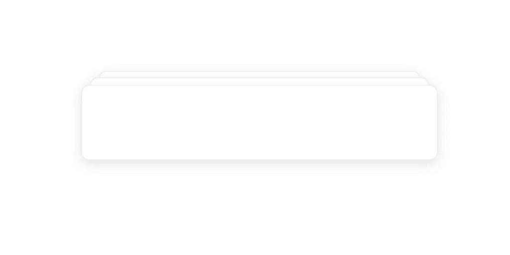
We can use a transform with translateY to visually show our different cards in a different position stack. This will get us closer to what we need to solve to get Sonner-style toasts, which is the ability to have more than one card on-screen and to do so in a way that makes clear to the user we've got a few of them. Each subsequent card should also be visually smaller, so we'll use a scale transform as well. Let's create those styles now:
The values you use for scale or the Y position are up to you. I've used values that were in use in this exercise in Emil's course, which I recommend you check out. They look quite good, and I decided not to arbitrarily change the values here. At this point you should now have 3 cards in a staggered stack.
Now let's take a look at how our cards are animating so far.
You'll notice that when they're appearing, these cards don't smoothly change their position nor animate in, so this approach isn't very convincing yet. The thing is, even if we applied an animate to animate these, you'll see that part of the reason for this deficiency is we're needing to hardcode the position of each card. Further, this won't scale to additional cards. A better approach here would be to use CSS variables to dynamically scale and position these cards.
A better approach: CSS variables
We'll update our card's definition to inject the index and count as variables.
Now we can control these styles dynamically, which not only allows for arbitrary numbers of cards, but will also let us animate between these values more convincingly. Let's update our styles to first position the elements dynamically:
Now we not only have correct, convincing positioning, but we can also support as many cards as we want. Next we'll want to add some animation. Let's try adding an entrance animation. We want to animate elements that appear in the DOM because this will feel more natural; nothing in nature arises from nothing. While we don't always want an enter animation, such as when an action is high frequency, for something like toasts this works well because we aren't seeing this element with high frequency as, say, a right-click menu. We also want to call special attention to its entrance as it may carry important information in this case, such as a notification content.
We'll define an animation that plays when our card appears in the DOM and avoids it appearing to instantly appear from nowhere, like so:
Now to have our animation applied to each card, we can simply add the animate property.
Now your cards should look something like the below.
Notice something wrong? If you don't, pause the video and advance it frame by frame. You should be able to notice that the Y value position when a new card is inserted appears to "jump" for the existing card. The reason for that is that we've only defined in our keyframes an opacity change. A question now is how to animate our Y value changes. It might seem confusing where to do that, since we animate opacity inside of keyframes and so it seems rather obvious we should just move our Y transformation there. That's not the case. Keyframes do not interpolate on variable updates, and we'll end up with jumpy card positioning when a new card enters. Instead, we can keep our transform for positioning where it is, which keeps keyframes scope to entrance effects that aren't about the final stacked positioning of the element. The responsibility for layout reflow motion lands with a transition property. Let's update our styles:
Now you'll have smooth interpolation between your cards Y positions.
What about exit animation for when the toasts go away? We'll need some special handling here, since we need to animate a property on exit but if it's not in the DOM, nothing will be animated. A simple approach here is an is-exiting class applied before actually clearing the array, with enough of a sleep after its application that the animation can complete. The backwards keyword we used on our entrance animation is what prevents the opacity value of the keyframes from interfering with our is-exiting animation's change.
Now when cards are removed from the array, they'll exit smoothly.
That's how you use CSS animation to create Sonner-like toasts. Of course if you want this in your application, I highly recommend using Sonner directly. And again, check out Emil's course for a far more in-depth look into animations. If you enjoyed this post, feel free to share it! If you'd like to get in touch, there are a few ways to get in touch here: michaelflores.io/contact.
Want to comment or like this story? Check it out on Medium.